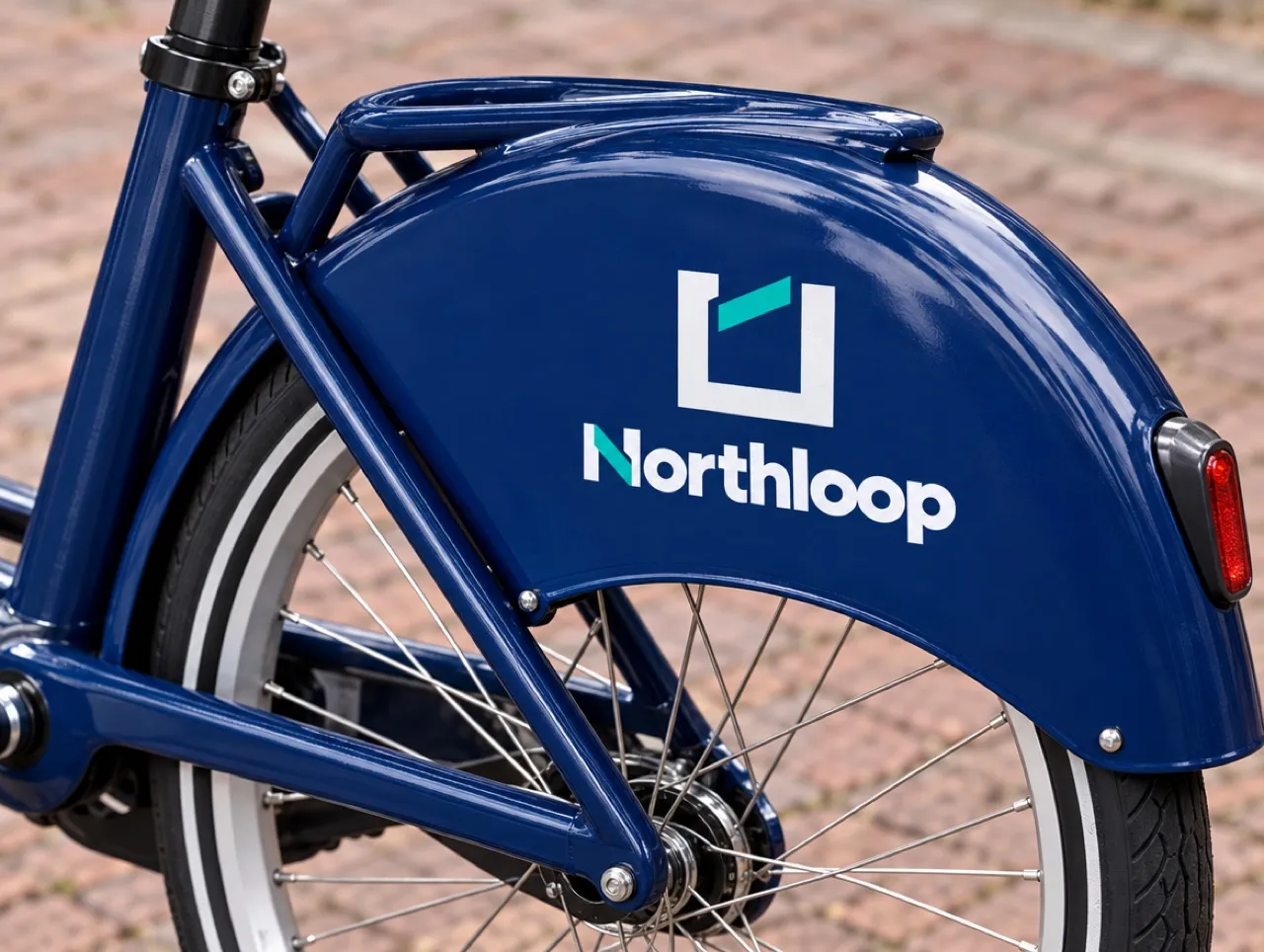
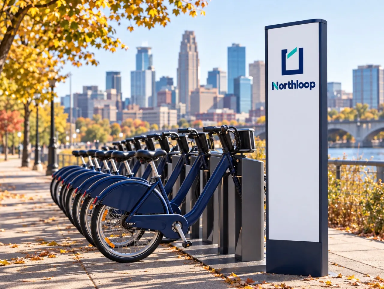
Northloop is the bike-share we use to show LogoPanel end to end. The team wrote one sentence about the service, locked the name and the city, and left the rest for the model to draft.
The brief
Commuters and students, a mid-size city, signs that have to read from across a street. The avoid list named the obvious: no wheels, no leaves, nothing that looks like a transit authority.
The debate
The panel proposed four directions. The critic pushed back on two of them for looking like competitors, and the strategist kept the one that worked as a loop on a sign and on a fender.
Where it lives
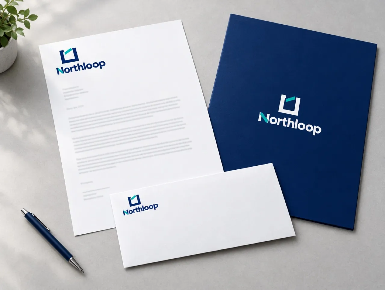
The team checked the mark on five mockups before deciding: a station sign, a bike fender, a bus shelter poster, a website header and a letterhead.

Written byLinda ParkRuns projects through the panel end to end, from brief to mockups.